
Design System Documentation Platform
A content strategy-led effort to replace a homegrown CMS & documentation site with a scalable, author-ready platform, built with a long-term vision for cross-team reuse.
Overview
My role
Led content strategy, product vision, and end-to-end execution. Set the strategic direction, aligned leadership on resourcing, and worked closely with engineering throughout. Partnered with a visual designer to completely redesign the front end.
Problems to solve
Our site had real user problems (findability, accessibility), but our homegrown CMS made them nearly impossible to fix. The authoring burden sat entirely with our team, which meant leadership didn't feel the pain. I needed to reframe the problem in terms they cared about and build a case for investment that went beyond our team's needs.
Scope
Documentation site redesign, CMS migration and content systems design, information architecture, authoring workflows, and a strategic framework for cross-team platform adoption.
The challenges
Inconsistency and scale
Documentation structure varied significantly across components.
Authors recreated structure from scratch instead of reusing patterns.
Critical guidance was buried or inconsistently labeled.
Technical and structural debt
Homegrown CMS required dev support for routine content updates.
30-minute database refresh cycles made previewing changes slow and error-prone.
Release process was fully manual, taking up to an hour every two weeks.
Backend couldn't scale to support new content types or contributors.
Accessibility gap
The old site wasn't accessible, and our colleagues felt it directly.
Internal sites weren't required by our org to meet accessibility standards, but the human cost was real.
Process
Strategic vision
The project had a single practical trigger: Our backend couldn't scale alongside the system’s growth, and every content update required dev support. But I saw an opportunity to build toward something bigger. Rather than pitch a CMS migration, I brought leadership a multi-pillar vision for what the site could be. Each one spoke to a different stakeholder concern, and together they reframed the project from a maintenance cost to a strategic investment.
-
Built on the right foundation, the documentation site could serve as a shared content platform for other teams across the org, reducing cognitive load for users already navigating multiple sites, and improving ROI for leadership.
-
Our old site wasn't accessible, and we had colleagues who felt that directly. One user told us they had to have a coworker read the documentation aloud to them because their screen reader couldn't parse it. Internal sites weren't required by our org to meet accessibility standards, but I made the case that there was a human cost in choosing not to, and that we had an obligation to our colleagues. Accessibility became a non-negotiable pillar of the new site from the start: all components were designed with greenlines, ADA QA testing was built into our development process, and all images were given alt text.
-
Our old site used our own design system's components inconsistently, a bad look for a team asking others to trust and adopt the system. As our design system evolved toward a more flexible framework, I saw an opportunity to use the site redesign as proof of concept. The new site is built entirely with our own components and tokens, repurposed for a use case they were never designed for (an internal documentation site rather than a customer-facing banking application). It functions as a living demonstration of what the composable framework can do, showing users what's possible when components are combined in new ways.
Execution
-
With the project greenlit, I audited existing documentation to identify reusable content types, inconsistencies in structure, and gaps in guidance. I paired this with user feedback to define the key experience problems the new site needed to solve: navigation, search, and findability.
-
I redesigned the IA to reflect how users actually search for and consume information: grouping by intent, flattening hierarchy, and standardizing page layouts. Validated through stakeholder interviews and tree testing.
-
This was the core of the work. For each content block in the new CMS, I led a full content strategy process: auditing existing content for reusable patterns, running competitive analysis across other design systems and beyond, defining block structure and required vs. optional fields, designing the authoring experience and labeling within the CMS, and writing author guidelines to ensure consistency at scale.
The platform vision was a consideration at every step. I didn’t just consider what our team needed, but how other teams might use each block.
-
To support federated contribution, I designed contribution guidelines, ownership models, CMS publishing guardrails, and intake workflows. Content authors could now publish without developer support, but with content oversight for publishing.
Examples
Mockups are representative examples created for portfolio purposes only.
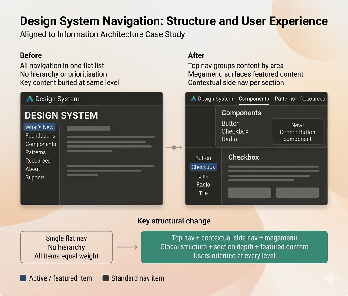
Change in navigation scheme to improve findability
Outcomes
First fully accessible version of the site, which met ADA standards we weren't required to hit. Every component was designed with accessibility greenlines, ADA QA was built into the development process, and all images were given alt text. We built it this way because it was the right thing to do for our colleagues.
The new site functions as a living proof of concept for our composable component framework, demonstrating what's possible when components are combined in ways they were never originally designed for.
Strategic framework and technical foundation in place for cross-team platform adoption. The vision is defined, the architecture supports it, and the path is clear.
96% faster
Content previews dropped from 30 minutes to under 2, saving the team the equivalent of a full day per release cycle.
98% decrease
Release prep went from 1 hour of manual, error-prone versioning every two weeks to a single publish action.
Takeaways
Reframing a problem for the right audience is as important as solving it. Each leader had a different concern, and earning buy‑in meant shaping a vision that addressed all of them. The work wasn’t just defining the solution, it was making sure everyone could see themselves in it.
Alignment is as important as execution. This project took nearly a year to get off the ground. I began with informal conversations across disciplines to understand needs and build early momentum. Formal alignment and signoff across product, design, and engineering took months, but that investment was essential to long‑term success.
Learn from past failures, even if they weren’t yours. A previous attempt to replatform the site had stalled, leaving leadership skeptical and teams wary of repeating wasted effort. I led a workshop with those involved to surface what hadn’t worked, what concerns remained, and how we could design a path forward that avoided the same pitfalls.
Content can lead vision. While many roles shaped the final direction, the vision was ultimately driven by content. We understood our users, their pain points, and the operational challenges authors faced, and we advocated for an experience that served both.
Accessibility doesn’t require a mandate, it requires a champion. Progress happened because someone was willing to make the case, not because it was required.
Treating content as a system unlocks scale. When content is structured as a system, authoring and publishing become faster and more consistent. And when a CMS is treated as a product, it becomes a powerful driver of design system adoption.