Design System Communication Playbook
A system for scaling communications with clarity, consistency, and speed
Overview
My role
Led content strategy, system design, framework creation and stakeholder alignment. Partnered closely with a visual designer for initial branding and templates.
Problems to solve
Inconsistent content and repeated work slowed handoffs and created friction across teams. Lack of shared purpose led to review churn and delayed releases.
Scope
Communications for an enterprise design system, including marketing for new system features, routine release notes, change management and outage messaging.
The challenges
Inconsistency and misalignment
Authors lacked guidance on adapting messaging to context
No shared framework, leading to misalignment and review delays
Inconsistent tone, imagery, and hierarchy across similar message types
Inefficient workflows
Heavy content‑to‑design handoffs slowed delivery
Risk of user confusion during high‑stakes communications like outages
Process
-
I audited 18 months of design system communications for voice and tone, imagery usage, layout patterns, hierarchy, and CTA placement.
Key insight: Messages varied in execution, but most shared common structural elements. The inconsistency came from contextual decisions, not from fundamentally different templates.
Takeaway: There was an opportunity to standardize structure while still allowing contextual flexibility.
-
I grouped emails into communication types and identified shared patterns, variable elements, and recurring author pain points. Most variation stemmed from factors like urgency, audience expectations, and emotional tone, not from different content needs.
Takeaway: Writers needed a decision framework to flex elements of the template thoughtfully.
-
To make contextual decisions explicit and repeatable, I designed a set of content scales that oriented each communication type:
Tone: Engaging ↔ Neutral / Direct
Imagery: Heavy ↔ Minimal / None
Visual emphasis: Brand-forward ↔ Utility-forward
Language style: Conversational ↔ Informational
Positioning each communication type along these scales gave authors a clear, consistent way to adapt messaging without reinventing structure.
Takeaway: The scales created a shared language for decision‑making.
-
Using the framework, I designed modular email templates with reusable blocks, flexibility guidance, and alignment to brand and accessibility standards. I then translated these into Figma components so authors could draft directly in Figma, reducing review cycles.
Later, the structured content model enabled our internal LLM to assemble ready‑to‑send HTML emails automatically, eliminating design handoffs entirely.
Takeaway: The system scaled from templates → modularity → automation, ultimately enabling AI‑powered email generation.
Examples
Mockups are representative examples created for portfolio purposes only.
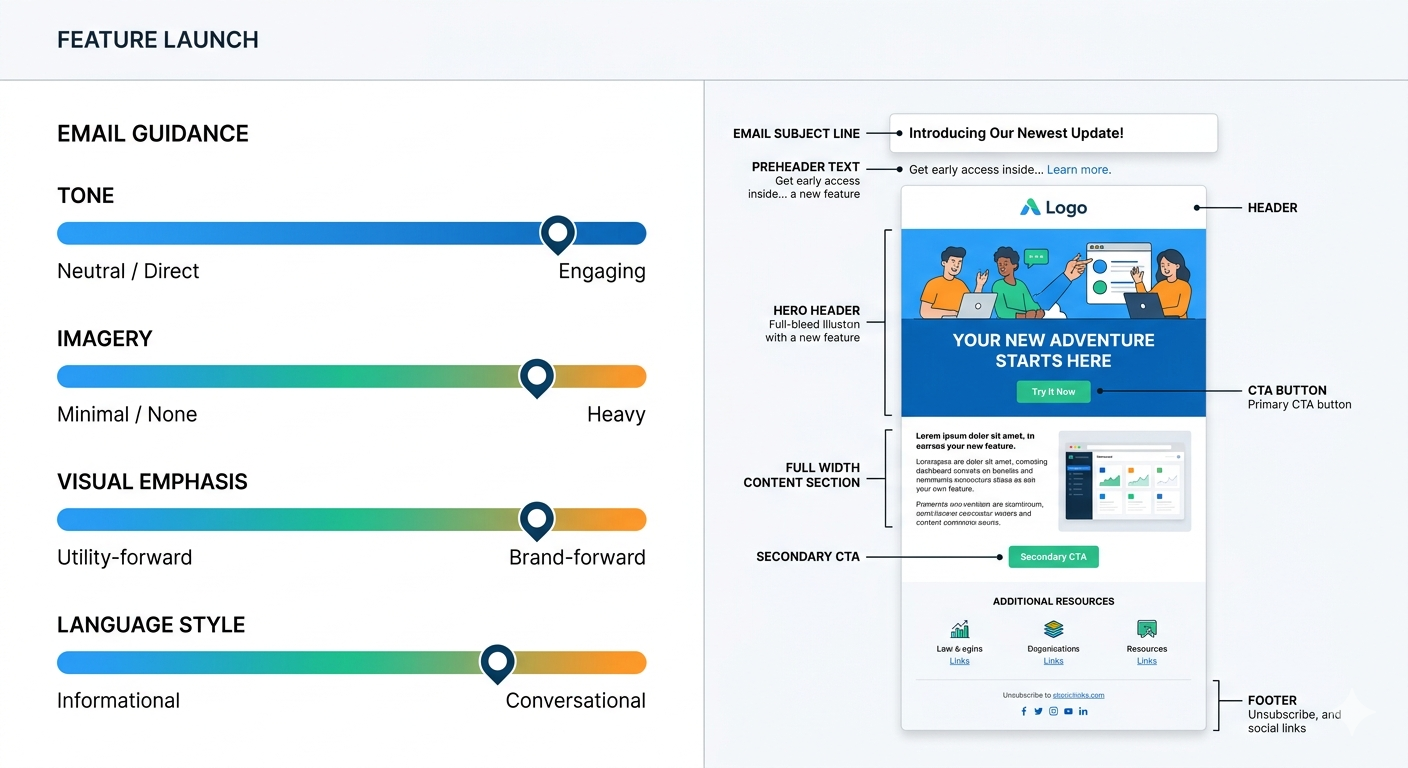
Content scales framework mapping communication type to tone, imagery, and style
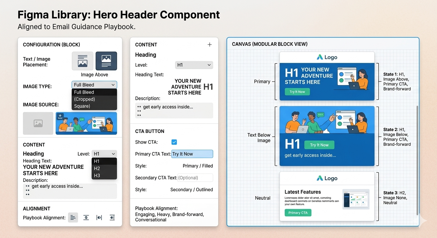
Figma component library translating playbook rules into reusable design blocks
Outcomes
Efficiency & speed
Eliminated content‑to‑design handoffs
Enabled LLM‑powered email generation
Reduced rounds of stakeholder review
Consistency & quality
Standardized structure and styles
Improved accessibility
Improved author confidence
90% ↓
Time spent converting
content to HTML
60% ↓
Rounds of review
Takeaways
Content systems work best when implicit decisions become explicit. By defining scales and structure early, I created a foundation that balanced consistency with flexibility, and unlocked speed we couldn’t have achieved otherwise.
The playbook evolved into a full communication system, enabling:
Brand‑aligned HTML templates for predictable quality
Modular, build‑your‑own emails via a custom Figma library
LLM‑powered HTML generation that produced Outlook‑ready emails in minutes
Because the system was built on structured, modular content, it transitioned seamlessly into AI‑powered workflows, even though it was created before those tools existed. It was future‑proof by design.